Build Your First Canvas
A canvas is the design that becomes your widget. In the editor, you build it by adding views, arranging them into a clear hierarchy, and adjusting the details until the preview looks right.
Canvases shows a preview of your widget. The preview in the app matches how the widget will look when you add it to your Home Screen or Lock Screen. The content can still change later through Shortcuts, so you can start with placeholder values like 21°, 82%, or “Next train 08:42”.
Choose a Size
Section titled “Choose a Size”Choose the widget size before you spend time on the layout. Small widgets are best for one focused idea. Medium and large widgets can hold more sections, but they still need a clear main point.
Choose the matching size in the editor for the widget you plan to add later. For example, if you want a small widget on the Home Screen, choose the small size in the editor. If you want a Lock Screen widget, choose the matching Lock Screen size.
Home Screen widgets can show richer layouts with images, colors, charts, and larger text. Lock Screen widgets are smaller and more limited, so they work best for compact information. The Lock Screen widgets guide explains those limits in more detail.
Add Views to the Canvas
Section titled “Add Views to the Canvas”Open the view picker and drag views onto the canvas. Start with the pieces that carry the meaning:
- A text view for labels, numbers, and status messages.
- A symbol view for a visual cue.
- A progress view for goals, battery levels, or completion.
- A chart view for small trends.
- A shape view for backgrounds and card surfaces.
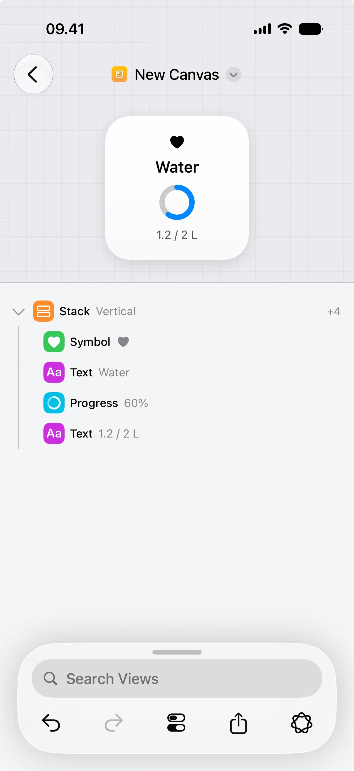
For a first canvas, try a focused status widget: add a text view with a temporary value, add a smaller text view below it, then add a symbol beside or above the text.
Nest Views Inside Others
Section titled “Nest Views Inside Others”Some views can contain other views. The view that contains others is the parent, and the views inside it are its children. Both stacks and buttons can have children.
A stack groups related views for layout: use a vertical stack for top-to-bottom layouts, a horizontal stack for rows, and a depth stack when views should overlap. A button holds its children so they become tappable. The view list shows the hierarchy, and you can use it to reorder views, move a view into a stack, or move it back to the top level.
Tweak the Design
Section titled “Tweak the Design”Select a view in the preview or in the view list, then adjust it in the inspector. Common adjustments include:
- Increase or reduce font sizes.
- Change colors for light and dark mode.
- Add padding so content has room to breathe.
- Add a background to group related content.
- Add a shadow when a card needs separation.
- Set a frame when a view should keep a stable size.
Check that the widget stays readable when text, numbers, or images change.
Add a Full-Size Background
Section titled “Add a Full-Size Background”A canvas has no background of its own because backgrounds belong to views. To fill the whole widget, add a view that covers the entire canvas and give that view a background.
A stack is a good choice, because it can grow to fill the space around your other views. There are two ways to make it expand: add spacer views inside it, or set its frame width and height to infinite so it fills the available space.
Once the stack fills the widget, give it a background, such as a gradient.
Rename the Canvas
Section titled “Rename the Canvas”A new canvas starts with a default name. To rename it, tap the name in the title, then choose Rename and type a new one. A clear name helps you find the canvas later, especially when you add it as a widget.
Plan for Live Data
Section titled “Plan for Live Data”Most widgets are more useful when their data can change over time, such as a temperature, battery status, coffee count, price, or next calendar event. You update that data using Shortcuts.
For dynamic data, design the widget with temporary values first. Use realistic placeholders so the layout has the right amount of space. For example, use 23° instead of “Temperature”, or 84% instead of “Battery”.
For any value Shortcuts should update, give that view a stable ID. For example, a text view that shows battery status could use battery-status, and a progress view that shows battery level could use battery-level.
You do not need IDs on every view. Add them only to views that Shortcuts will update later. You can update those views from Shortcuts or keep the widget fresh by running a Shortcuts automation on a schedule.
When the canvas looks good, add it as a widget on the Home Screen or Lock Screen.