
Grid
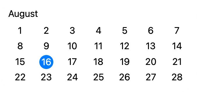
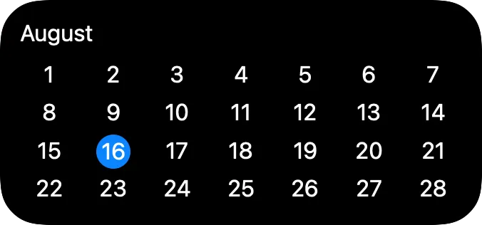
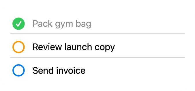
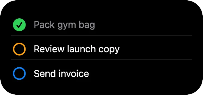
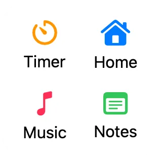
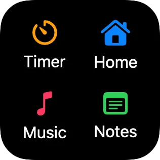
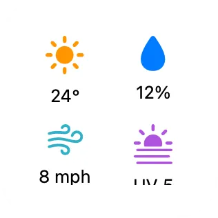
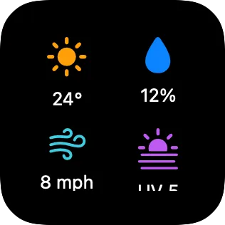
A grid arranges child views in rows and columns. Use a grid when a canvas needs repeated structure, such as a calendar, menu, task list, schedule, dashboard, or set of status cells.
The Columns setting controls how many cells appear in each row. Extra children continue on new rows.
A one-column grid works like a list. Use it when each child should become its own row.
Templates
Section titled “Templates”Templates help when a shortcut fills a grid with many similar items, such as days in a calendar or rows in a checklist. You design one or more example cells in Canvases, then the shortcut uses those cells as the starting point for the real content.
Turn on the Template Children setting when the grid should be filled by Shortcuts. The views you place directly inside the grid become templates. A template can contain other views, such as a stack with text, symbols, and shapes.
When a shortcut creates children from those templates, the created children are what appear in widgets. If you edit a template after children have been created, run the shortcut again to recreate those children from the updated template.
Give the grid an ID so Shortcuts can select it. Give each template child an ID if you want to choose that template in the Create View from Template action.
The Editor Shows setting controls what you see while editing. Choose Templates when you want to edit the template cells. Choose Created Children when you want to inspect the latest children made by Shortcuts.
The Template Copies setting repeats templates in the editor, which helps you preview a filled grid before a shortcut has created children.
Use Fill a Grid from Shortcuts for the full Shortcuts workflow.
Spacing
Section titled “Spacing”Column Layout controls columns. Row Layout controls rows. You can use a different mode for each direction.
| Setting | Description |
|---|---|
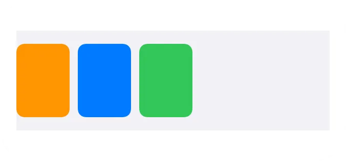
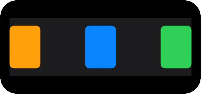
| Fixed Spacing | Keeps cells compact and uses the spacing value you set. |
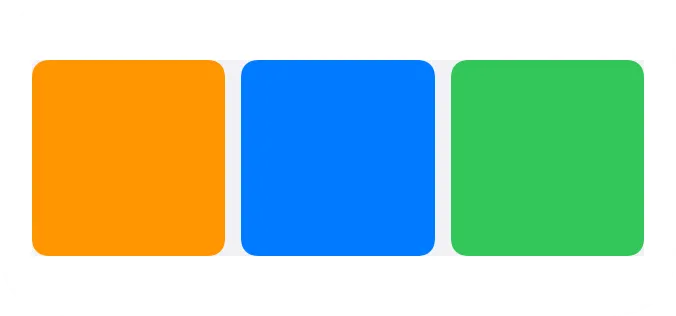
| Equal Size | Stretches cells so columns or rows share the available space. |
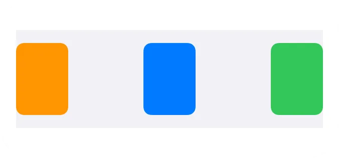
| Equal Spacing | Keeps cells compact and spreads the empty space between them evenly. |
Fixed Spacing is the default. Use it when the grid should stay only as large as its cells need.
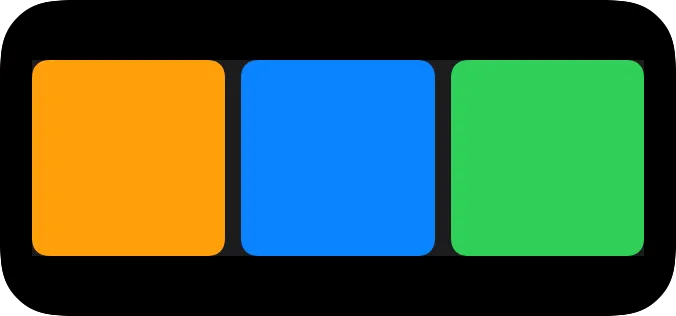
The examples below show the same grid with each spacing mode.

Dividers
Section titled “Dividers”A grid can show dividers between rows, columns, or both. Dividers can be solid, dashed, or dotted.
Properties
Section titled “Properties”Identity
Section titled “Identity”| Property | Description |
|---|---|
| ID | Identifies the grid so Shortcuts can select it. Keep it stable for automations. |
| Visible | Hides the grid without deleting it. Hidden grids are not shown, but they stay in the canvas. |
Grid Layout
Section titled “Grid Layout”| Property | Description |
|---|---|
| Columns | Sets how many cells appear across each row. |
| Column Layout | Controls whether columns use Fixed Spacing, Equal Size, or Equal Spacing. |
| Horizontal Spacing | Sets the exact space between columns for Fixed Spacing and Equal Size. |
| Row Layout | Controls whether rows use Fixed Spacing, Equal Size, or Equal Spacing. |
| Vertical Spacing | Sets the exact space between rows for Fixed Spacing and Equal Size. |
| Template Children | Treats direct children as templates for children created by Shortcuts. |
| Editor Shows | Chooses whether the editor canvas shows templates or created children. Editor only. |
| Template Copies | Repeats the templates in the editor while Editor Shows is set to Templates. Editor only. |
Divider Properties
Section titled “Divider Properties”| Property | Description |
|---|---|
| Horizontal Dividers | Shows or hides dividers between rows. |
| Horizontal Divider Style | Sets horizontal dividers to solid, dashed, or dotted. |
| Horizontal Divider Color | Sets the horizontal divider color. |
| Vertical Dividers | Shows or hides dividers between columns. |
| Vertical Divider Style | Sets vertical dividers to solid, dashed, or dotted. |
| Vertical Divider Color | Sets the vertical divider color. |
Layout Properties
Section titled “Layout Properties”| Property | Description |
|---|---|
| Frame | Controls size and alignment. |
| Offset | Moves the view visually with an offset. |
| Padding | Adds padding. |
Appearance
Section titled “Appearance”| Property | Description |
|---|---|
| Opacity | Sets transparency from 0 to 100. |
| Background | Adds a background. |
| Shadow | Adds a shadow. |
| Clip Shape | Clips the view to a shape. |
| Border | Adds a border. |