
Image
An image view displays an image inside a canvas.
Use images when the picture itself matters, or when a visual cue works better than text.
Size and Crop Images
Section titled “Size and Crop Images”Aspect Ratio controls whether the image keeps its proportions. Turn it on to choose Fit or Fill. Turn it off when the image should take the frame’s exact size, even if that changes its proportions.
Use Fit when the full image should remain visible. Use Fill when the image should fill its frame and cropping is acceptable.






Rendering Mode
Section titled “Rendering Mode”Rendering Mode controls how the image uses color. Full Color keeps the image colors. Accented uses the system accent treatment, and desaturated reduces color so the image feels quieter in the widget.
Use Full Color when the original image colors matter. Use Accented or Desaturated rendering when the image should behave more like an icon or visual marker.
Update Images from Shortcuts
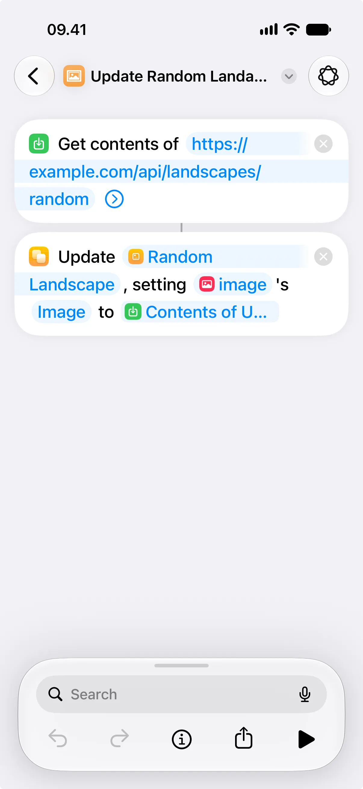
Section titled “Update Images from Shortcuts”Give the image view an ID when a shortcut should replace the image later. In Update View, choose that ID, set Property to Image, then fill in the Image field.
Shortcuts shows the file picker by default when you tap the Image field. To use the output of another action instead, touch and hold the Image field, then choose a variable. For example, you can pass the output of Get Contents of URL into Update View.
Properties
Section titled “Properties”Identity
Section titled “Identity”| Property | Description |
|---|---|
| ID | Identifies the view so you can find it in the canvas and modify it with Shortcuts actions. Keep it stable for automations. |
| Visible | Hides the view without deleting it. Hidden views are not shown, but they stay in the canvas. |
| Property | Description |
|---|---|
| Image | Chooses the image to display. |
| Rendering Mode | Chooses how the image uses color. Full Color keeps the image colors. Accented and desaturated modes adjust color. |
| Aspect Ratio | Controls whether the image keeps its proportions. When enabled, Content Mode chooses Fit or Fill. |
Layout
Section titled “Layout”| Property | Description |
|---|---|
| Frame | Controls size and alignment. |
| Offset | Moves the view visually with an offset. |
| Padding | Adds padding. |
Appearance
Section titled “Appearance”| Property | Description |
|---|---|
| Opacity | Sets transparency from 0 to 100. |
| Background | Adds a background. |
| Shadow | Adds a shadow. |
| Clip Shape | Clips the view to a shape. |
| Border | Adds a border. |