Chart
A chart shows a small set of numbers as bars, a line, an area, or points. Use it for trends, history, comparisons, and small dashboards.
When a shortcut updates a chart, keep values, labels, and colors in the same order so each data point stays matched to its label and color.
Choose a Chart Style
Section titled “Choose a Chart Style”The Style property chooses how the chart draws the same data.
- Bar charts draw one bar for each data point. Corner Radius applies to bars, and Bar Colors can set individual bar colors.
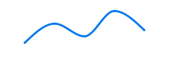
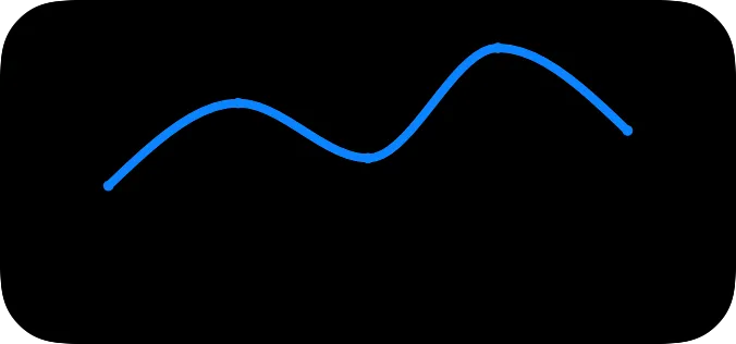
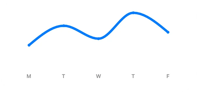
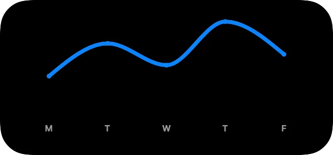
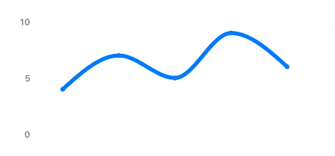
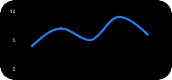
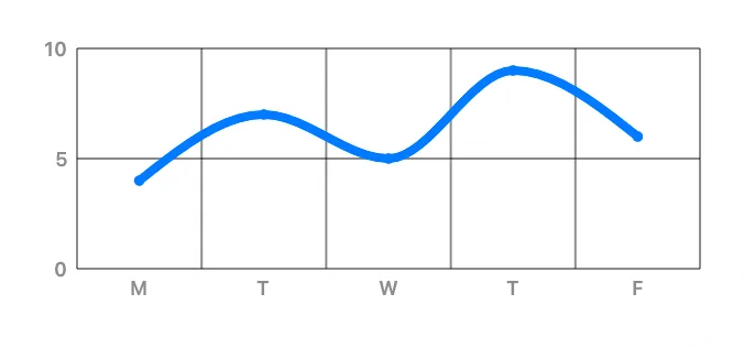
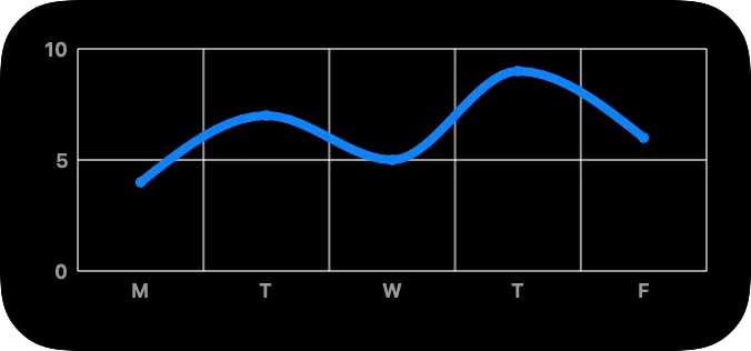
- Line charts connect data points with a line. Curve controls how the line connects points, Line Width controls the line thickness, and Point Size and Marker Color control optional point markers.
- Area charts fill the area below the line. They also use Curve, Line Width, Point Size, and Marker Color.
- Point charts draw point markers without bars or connecting lines.

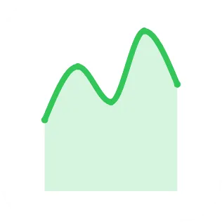
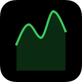
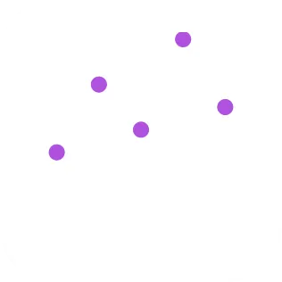
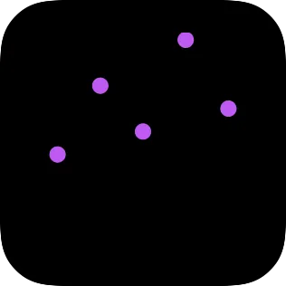
Chart Data
Section titled “Chart Data”Chart data is a set of related lists. Y Values contains the numbers the chart draws. X Labels, X Values, and Bar Colors match those numbers by position.
For example, a weekly bar chart can use this data:
| Position | Y Value | X Label | X Value | Bar Color |
|---|---|---|---|---|
| 1 | 4 | Mon | 1 | #007AFF |
| 2 | 6 | Tue | 2 | #34C759 |
| 3 | 5 | Wed | 3 | #FF9500 |
The first label belongs to the first value, the second label belongs to the second value, and so on. The same order is used for custom X values and per-bar colors.
The chart uses only paired Y values and X labels. If one list is shorter than the other, extra items in the longer list are not drawn.
Per-bar colors assign colors to individual bars and apply only to bar charts.
X Positions
Section titled “X Positions”X Positions chooses how data points are distributed along the X axis.
With automatic X positions, points are distributed evenly in list order. You only need Y Values and X Labels. X Values is ignored.
With custom X positions, each X Value sets the numeric X position for the matching Y value. Custom X values are used only when the number of X values matches the number of paired Y values and X labels. If the count does not match, the chart falls back to automatic distribution.
When custom X positions are used, points are drawn in numeric X order.
Use automatic X positions for evenly spaced data, such as days of the week. Use custom X positions for uneven data, such as measurements taken after 1, 4, and 9 hours.
Y Range
Section titled “Y Range”Y Range controls the scale of the Y axis. Leave it automatic to derive the scale from the data.
Set a minimum, maximum, or both to fix the scale. If only one bound is set, the other bound is derived from the data. If the minimum is not lower than the maximum, the chart falls back to an automatic range.
Axes and Grid Lines
Section titled “Axes and Grid Lines”Axis label properties control the text shown along each axis. Grid line properties control the reference lines drawn behind the chart.
Y Unit adds text before or after Y axis values. No separator is inserted, so include a space in the unit if you want one.
Update Charts from Shortcuts
Section titled “Update Charts from Shortcuts”For a weekly chart, a shortcut might set:
- Y Values: 4, 6, 5
- X Labels: Mon, Tue, Wed
For irregular readings, set X Positions to Custom and provide one numeric X value for each Y value. For a bar chart with individual colors, provide one Bar Colors item for each bar that needs its own color.
For example, irregular readings after 1, 4, and 9 hours can use:
- Y Values: 40, 58, 63
- X Labels: 1h, 4h, 9h
- X Values: 1, 4, 9
Number lists are entered as separate text values in Shortcuts. Decimal numbers follow your device’s number format. Depending on your locale, both 1.5 and 1,5 can be valid ways to enter a decimal number.
Common Problems
Section titled “Common Problems”- If some bars do not use custom colors, the Bar Colors list may be shorter than the drawn data point list.
- If Bar Colors has no effect, check that Style is Bar.
- If custom X values do not change the chart, check that X Positions is Custom and that X Values has one value for each paired Y value and X label.
- If extra values or labels do not appear, check that Y Values and X Labels have the same number of items.
- If the chart scale changes between updates, set a fixed Y Range.
Properties
Section titled “Properties”Identity
Section titled “Identity”| Property | Description |
|---|---|
| ID | Identifies the view so you can find it in the canvas and modify it with Shortcuts actions. Keep it stable for automations. |
| Visible | Hides the view without deleting it. Hidden views are not shown, but they stay in the canvas. |
Chart Style
Section titled “Chart Style”| Property | Description |
|---|---|
| Style | Chooses bar, line, area, or point style. |
| Chart Color | Sets the line or area color. For bar charts, Update View can use Chart Color to replace all bar colors. Point charts use Marker Color. |
| Corner Radius | Rounds bar corners. This applies to bar charts. |
| Curve | Chooses how line and area charts connect points. |
| Line Width | Sets line thickness for line and area charts. |
| Point Size | Sets point marker size for line, area, and point charts. Use 0 to hide line and area markers. |
| Marker Color | Sets point marker color. |
| Property | Description |
|---|---|
| Y Values | Sets the numbers shown by the chart. |
| X Labels | Sets labels for the X axis. Labels are matched to Y values by position. |
| X Positions | Chooses automatic distribution or custom X positions. |
| X Values | Sets custom numeric X positions. Used only when X Positions is Custom and the count matches the drawn data count. |
| Bar Colors | Sets per-bar colors for bar charts. |
X Axis
Section titled “X Axis”| Property | Description |
|---|---|
| X Axis Labels | Shows or hides X axis labels. |
| X Label Color | Sets X label color. |
| X Label Font | Sets X label font. |
| X Grid Lines | Shows or hides X grid lines, with solid or dashed line options. |
| X Grid Line Color | Sets X grid line color. |
Y Axis
Section titled “Y Axis”| Property | Description |
|---|---|
| Y Axis Labels | Shows or hides Y axis labels, and chooses the leading or trailing side. |
| Y Label Color | Sets Y label color. |
| Y Label Font | Sets Y label font. |
| Y Unit | Adds a unit to Y labels, such as %, kr, or kg. |
| Y Unit Position | Chooses whether the Y unit appears before or after each value. |
| Y Grid Lines | Shows or hides Y grid lines, with solid or dashed line options. |
| Y Grid Line Color | Sets Y grid line color. |
| Y Range | Sets automatic or fixed Y axis bounds. See Y Range for behavior. |
Layout
Section titled “Layout”| Property | Description |
|---|---|
| Frame | Controls size and alignment. |
| Offset | Moves the view visually with an offset. |
| Padding | Adds padding. |
Appearance
Section titled “Appearance”| Property | Description |
|---|---|
| Opacity | Sets transparency from 0 to 100. |
| Background | Adds a background. |
| Shadow | Adds a shadow. |
| Clip Shape | Clips the view to a shape. |
| Border | Adds a border. |