Frames
Frames control how much layout space a view asks for. They are one of the main tools for keeping a widget stable when text, numbers, images, or chart data changes.
Frame size is separate from the content inside the frame. A symbol can sit inside a larger frame. Text can fill a row while its letters stay aligned to one side. A stack can fill the whole widget and hold other views inside it.
Width and Height
Section titled “Width and Height”A frame has a width and a height. Both are measured in points.
By default, the Frame setting shows width and height fields. W controls width, and H controls height. Leave a field empty when that side should stay Auto. Enter a number when that side should be fixed.
Each side can be automatic, fixed, or flexible:
| Mode | Description |
|---|---|
| Automatic | Uses the view’s natural size on that side. |
| Fixed | Uses an exact point value on that side. |
| Range | Sets a minimum, a maximum, or both, so the view can grow within limits. |
| Fill | Lets the view take the available space on that side. In the editor, this is made with Range and Infinity. |
You can set only one side. For example, a view can have a fixed width while the height stays automatic.
The screenshots below show the sizing modes. The pale surface marks the frame area when the frame is larger than the content.






Automatic Size
Section titled “Automatic Size”Auto means the view decides its own size from its content. A short text label stays close to the text. A symbol stays close to the symbol. A stack sizes itself from the child views inside it.
Automatic size is a good starting point when the content has a predictable size. It can be less stable when the content changes, because longer text or larger data can make the view need more space.
Fixed Size
Section titled “Fixed Size”Fixed size sets an exact width or height in points. Use it when a view should keep a stable area even if the surrounding content changes.
Fixed frames are useful for symbols, images, chart areas, progress rings, and other elements that should not resize based on nearby content.
Range and Infinity
Section titled “Range and Infinity”Range gives an axis a minimum size, maximum size, or both. The minimum field uses the down arrow. The maximum field uses the up arrow.
The range button switches the Frame setting from width and height fields to minimum and maximum controls. Each axis then has a minimum field, a maximum field, and an Infinity button.
Auto in a range field means that side of the range is not set. For example, an automatic minimum means there is no minimum. An automatic maximum means there is no maximum unless Infinity is turned on.
Infinity sets the maximum size to all available space on that axis. It does not make the view endlessly large. It tells the parent layout that the view is allowed to grow as far as the parent can offer.
Turning on Infinity disables the maximum field because the maximum is now all available space.
Use Infinity when a view should fill remaining space. For example, set a stack’s width and height to Infinity when the stack should cover the whole widget before you add a background to it.
If Infinity appears to do nothing, the parent may not have extra space to give. Fill behavior is easiest to see inside a stack or on a root view that has access to the widget’s full area.
Alignment
Section titled “Alignment”Alignment decides where the content sits when the frame is larger than the content. It has no visible effect when the frame is the same size as the content.
The alignment row uses a 3 x 3 grid. Each icon shows where the content sits inside the frame:
| Alignment area | Description |
|---|---|
| Top | Places content along the top edge of the frame. |
| Center | Places content in the middle of the frame. |
| Bottom | Places content along the bottom edge of the frame. |
| Leading | Places content at the start edge of the frame. |
| Trailing | Places content at the end edge of the frame. |
The corner choices combine the vertical and horizontal positions, such as Top Leading or Bottom Trailing.
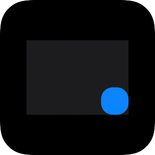
The screenshots below use a fixed frame so alignment has extra space to work with. The pale surface marks the frame area.